
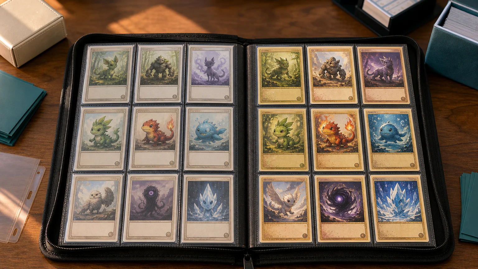
TLDR: Choose Shadowless if you want your binder to feel tightly focused on the earliest English Base Set presentation. Choose Base Set 2 if you prefer a broader Kanto showcase that mixes selected Base Set and Jungle cards, uses a clearly visible set symbol, and gives holographic cards the distinctive Cosmos Holofoil treatment. For pure visual coherence, my pick is Shadowless. For a colorful nostalgia binder with more variety, Base Set 2 is easier to build around.
The confusing part of comparing shadowless vs base set 2 pokemon cards is that they are not two equivalent sets. Shadowless describes an early layout used on English Base Set cards. Base Set 2 is a separate expansion released later, with its own checklist, numbering, expansion symbol, and combination of reprinted cards.
That distinction also explains why the two options create such different binders. Shadowless feels like a study of one foundational release. Base Set 2 feels closer to a curated replay of early Pokémon TCG nostalgia, with familiar cards from two expansions brought under one visual identity.
Shadowless vs Base Set 2: the short answer
| Feature | Shadowless Base Set | Base Set 2 |
|---|---|---|
| What it is | An early English Base Set print style | A separate English expansion |
| Front identifier | No drop shadow along the right and bottom of the artwork window | Poké Ball expansion symbol |
| Checklist size | Part of the 102-card Base Set | 130 cards |
| Card pool | Original Base Set checklist | Selected reprints from Base Set and Jungle |
| Holo distinction | Do not identify it by foil appearance alone | Documented as the first English expansion to use Cosmos Holofoil |
| Best binder use | Focused early-Base-Set presentation | Broader Kanto-era nostalgia collection |
English Base Set was released on January 9, 1999 and contains 102 cards. Base Set 2 followed as a distinct 130-card expansion on February 24, 2000. It combined selected reprints from Base Set and Jungle rather than reproducing the original Base Set checklist card for card.
Why Shadowless is a print style, not another expansion
On a later Unlimited Base Set card, the artwork window has a drop shadow running along its right and bottom edges. Shadowless cards lack that visual effect, leaving the artwork frame looking flatter and slightly cleaner. The difference is subtle until you place the versions beside each other; after that, the heavier Unlimited frame becomes difficult to miss.
The term does not mean that every card carries a 1st Edition stamp. Collector references distinguish both stamped 1st Edition Shadowless cards and unstamped Shadowless cards from the later Unlimited layout. In other words, “Shadowless” describes the relevant front layout, while “1st Edition” describes the presence of the stamp.
For a checklist and additional background, the Base Set reference at Bulbapedia is a useful place to start. PSA also maintains a labeled 1999 Base Set Shadowless image gallery, which can help when you want to study complete card fronts rather than rely on a single cropped example.
This early presentation has become one of the recognizable versions of the classic Base Set aesthetic. Pokémon itself later described XY—Evolutions as revisiting the original artwork and style of classic Base Set, illustrating how strongly that original visual language remains associated with the beginning of the English-language game.
How to identify the cards from the front
Check the artwork frame on a suspected Shadowless card
Look immediately to the right and bottom of the illustration box. If the heavy drop shadow is absent, the card may use the Shadowless layout. Treat this as a layout check rather than a complete authentication process: condition, authenticity, and printing classification can require more context than one design feature.
The 1st Edition stamp answers a different question. A stamped card can belong to the Shadowless group, but an unstamped card can also be Shadowless. This is why sorting solely into “1st Edition” and “Unlimited” piles can overlook an important Base Set variation.
Find the Poké Ball symbol on Base Set 2
Base Set 2 is much more explicit about its identity. Its cards carry a Poké Ball expansion symbol, and their collector numbers use a denominator of 130. Those two features make it straightforward to separate Base Set 2 from symbol-free Base Set cards during a binder sort.
- Check the expansion-symbol area first. A Base Set 2 Poké Ball symbol settles the set question quickly.
- Read the collector number. A number presented as part of a 130-card checklist points to Base Set 2.
- If there is no Base Set 2 symbol, inspect the artwork window for the Shadowless layout.
- Sort by expansion and printing before arranging by Pokémon, type, or Pokédex number. This prevents a full binder reshuffle later.
The visual difference is bigger than one missing shadow
A Shadowless page has an unusually restrained look. The absence of the artwork-window drop shadow reduces one layer of visual weight, while the symbol-free Base Set layout keeps attention on the Pokémon, card name, and illustration. Nine cards from the same printing can look remarkably unified even when their types and background colors differ.
Base Set 2 adds a small but recurring Poké Ball symbol across the page. More importantly, its checklist draws from both Base Set and Jungle. That creates more variety in the Pokémon and artwork represented, but it also makes the binder feel less like a frozen snapshot of the original Base Set checklist.
Neither approach is inherently more attractive. Shadowless wins if your idea of “vintage” means a precise early printing presentation. Base Set 2 wins if it means opening a binder and seeing a concentrated dose of familiar early-era Pokémon without insisting that every card came from the same original expansion.
Why Base Set 2 holos have their own personality
Base Set 2 is documented as the first English expansion to use Cosmos Holofoil. Its scattered, cosmic-looking highlights give a page of holographic cards a different rhythm from a page built around ordinary non-holo cards. The exact appearance naturally changes with lighting and from card to card, so a binder page will not look like a perfectly repeated pattern.
This is one place where Base Set 2 has a strong display argument. A dedicated holo page can feel connected through the shared expansion identity while still giving each card a slightly different arrangement of visible highlights. If your binder is meant to be opened under a desk lamp and tilted around for the full cardboard-magpie experience, that variation is part of the appeal.
Do not use holo appearance as your only Shadowless identifier. The supplied evidence supports the Cosmos distinction for Base Set 2, but the artwork frame, stamp, set symbol, and numbering are more useful starting points for this comparison.
Starter families make a strong binder centerpiece
Both directions can support a page centered on the original starter families: Bulbasaur, Charmander, and Squirtle with their evolutions. Their presence gives the project an obvious visual anchor, especially for a smaller binder that is not intended to become a complete checklist collection. The relevant Base Set and Base Set 2 checklists document those families within their respective card pools.
For Shadowless, I would arrange the three evolution lines as vertical columns. That makes the page read like a deliberate early-Base-Set display rather than nine unrelated old cards. If Charizard is the centerpiece of the project, the vintage Charizard binder guide offers a narrower way to plan the surrounding page.
For Base Set 2, consider placing the final evolutions across the middle row and using other favorite Base Set 2 holos around them. That leans into the expansion's combined-reprint identity instead of making it imitate a Base Set-only page.
Which makes the more coherent vintage binder?
Shadowless is the stronger choice for a historically narrow binder. Every page can follow the same rule: early Base Set layout, arranged by card number, type, evolution family, or rarity. That constraint makes gaps obvious, but it also makes the finished pages feel intentional.
Base Set 2 is better for a nostalgia-first binder. Because the expansion selects cards from Base Set and Jungle, you can get a wider early-era cast while retaining one set symbol and one numbering system. The result is coherent as a Base Set 2 collection, even though the artwork originated across two earlier expansions.
A mixed binder can work too, but give the difference a visible boundary. Do not alternate Shadowless and Base Set 2 cards randomly across every page unless the project is explicitly organized by Pokémon. Use divider pages, labeled sections, or separate rows. Otherwise, the recurring Base Set 2 symbol and shifting frame treatment can make the layout look accidental.
- Choose Shadowless for an original-Base-Set study, minimalist pages, or a printing-variant collection.
- Choose Base Set 2 for a larger set project, a Base Set-and-Jungle nostalgia mix, or a Cosmos Holofoil showcase.
- Choose both when your binder is organized by Pokémon or evolution family, but label each printing clearly.
- Start with one nine-card page before committing to a complete checklist. Starter families, favorite holos, or one type make manageable test layouts.
If you are building with clearly labeled display reproductions rather than authentic vintage cards, the same organizational logic still applies. The vintage Pokémon proxy binder guide covers theme selection, labeling, and keeping the project visually organized.
Common questions about Shadowless and Base Set 2
Is every Shadowless card 1st Edition?
No. Collector references distinguish 1st Edition Shadowless cards and unstamped Shadowless cards. The missing artwork-window shadow identifies the layout family; the stamp identifies the 1st Edition version.
Is Base Set 2 another printing of Base Set?
No. Base Set 2 is a separate 130-card expansion with its own Poké Ball symbol and checklist. It includes selected reprints from both Base Set and Jungle.
Should Shadowless and Base Set 2 cards share a binder page?
They can if the page is organized around a Pokémon, evolution line, artist, or another clearly stated theme. For a set-history binder, separate sections will usually look cleaner because the frame treatments, symbols, and checklist identities are visibly different.
The practical pick
For the cleanest vintage binder, start with Shadowless and build one focused page around the starter families or another favorite group from Base Set. The restrained layout and single-expansion identity do most of the design work for you.
Pick Base Set 2 instead if you want more character variety and a holo-centered display without abandoning a consistent expansion symbol and numbering system. Whichever route you take, decide at the beginning whether the binder is organized by printing, expansion, or Pokémon. That one choice will save you from the collector's traditional punishment: moving six full pages because one new card arrived.